Problem
The reproduction of their logo was not consistent throughout the company’s point of sale, marketing, digital channels as well as 3D printing. Their logo was illegible at a small size, so as a result, designers and printers would add their own typography to it to make it more legible.
Solution
To modernise the logo in order to make it more usable, relevant and easier to reproduce.
My Approach to The Design
Envision - Phase 1
I created the SKG new logo using what I like to call the RITE method (Rapid Iterative Testing and Evaluation) with the entire staff of the SKG office because I believe that a company logo should resonate with its people who have worked long enough in the company and carry the values and missions of a company, not to mention it is an absolutely fun process for everyone.
Initially, I had a meeting with the Managing Director of SKG, to understand his goal for this modernisation and ensure he understands the implications of it. It was important to have a mutual understanding of what this modernisation would cost and how much is the company willing to invest in it.
After several meetings and discussions, it was defiantly a path that SKG stakeholders wanted to invest in, and since I was running the logo modernisation project in between their website enhancement project, it was much easier to incorporate the RITE method in between.
Discovery & Define - Phase 2 & 3
I first gathered all the different samples of the existing logo, I also needed to understand what artifacts had to be reproduced as a result of this change.
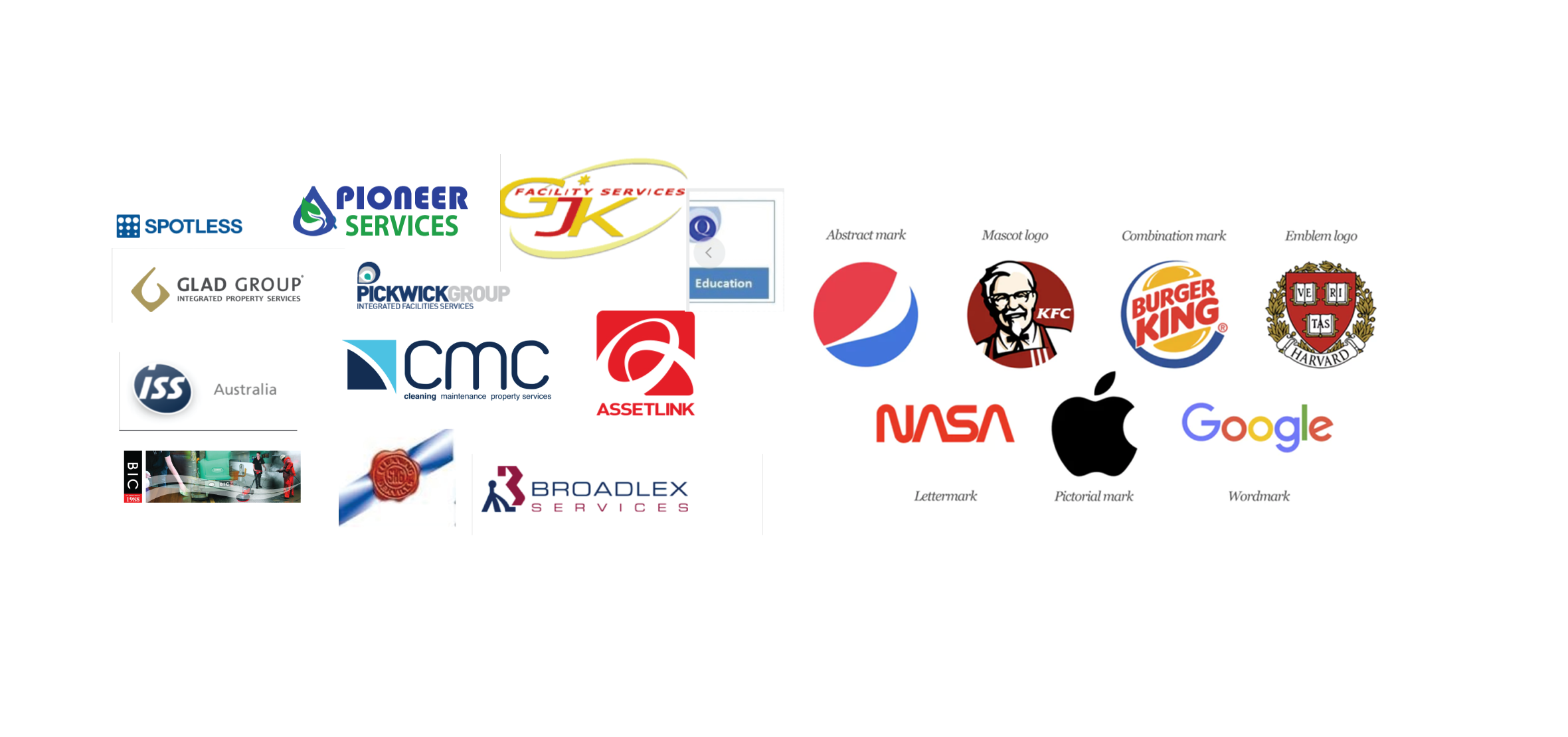
I then did a chart of about 15 different cleaning companies logos that operate in Australia and overseas, I included 10 if the companies that the SKG saw as competitors. This exercise was to also show my client the type of logos that one can design from Abstract to Watermark, Pictorial etc
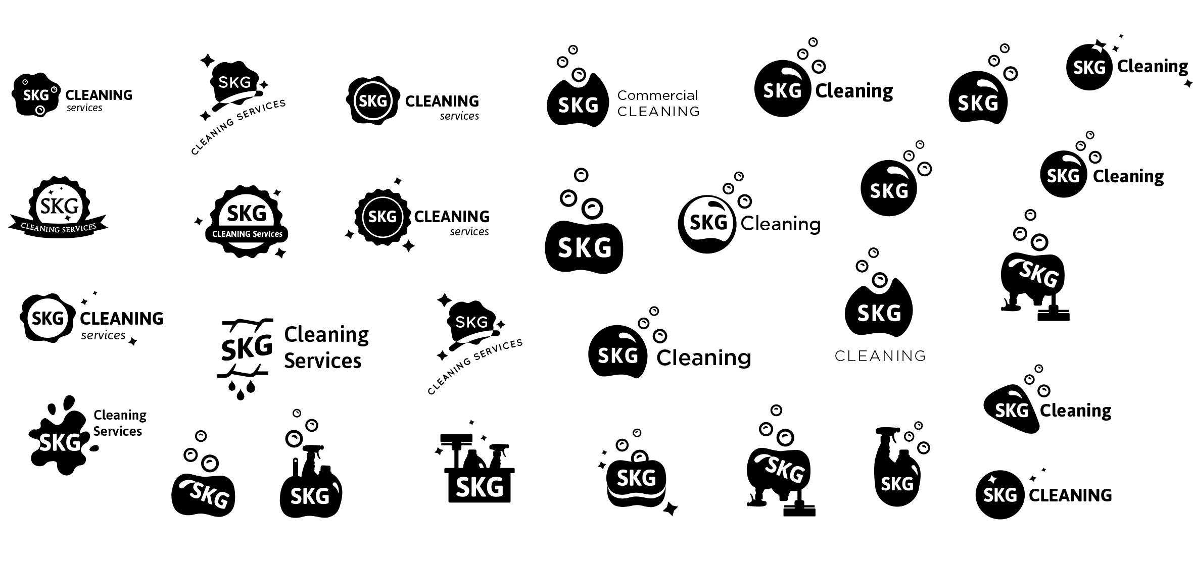
Then it was time to create a skeleton of these concepts, kind of like wireframes cause they’re always in black and white. I believe if a logo is not appealing in black and white, then it will never look good in colour, and vice versa, if it attracts you in black and white, then it will look great in colour.
I created only 14 of them as wireframes or black and white, then it was time to present them to SKG to get some feedback. That was the first iteration.
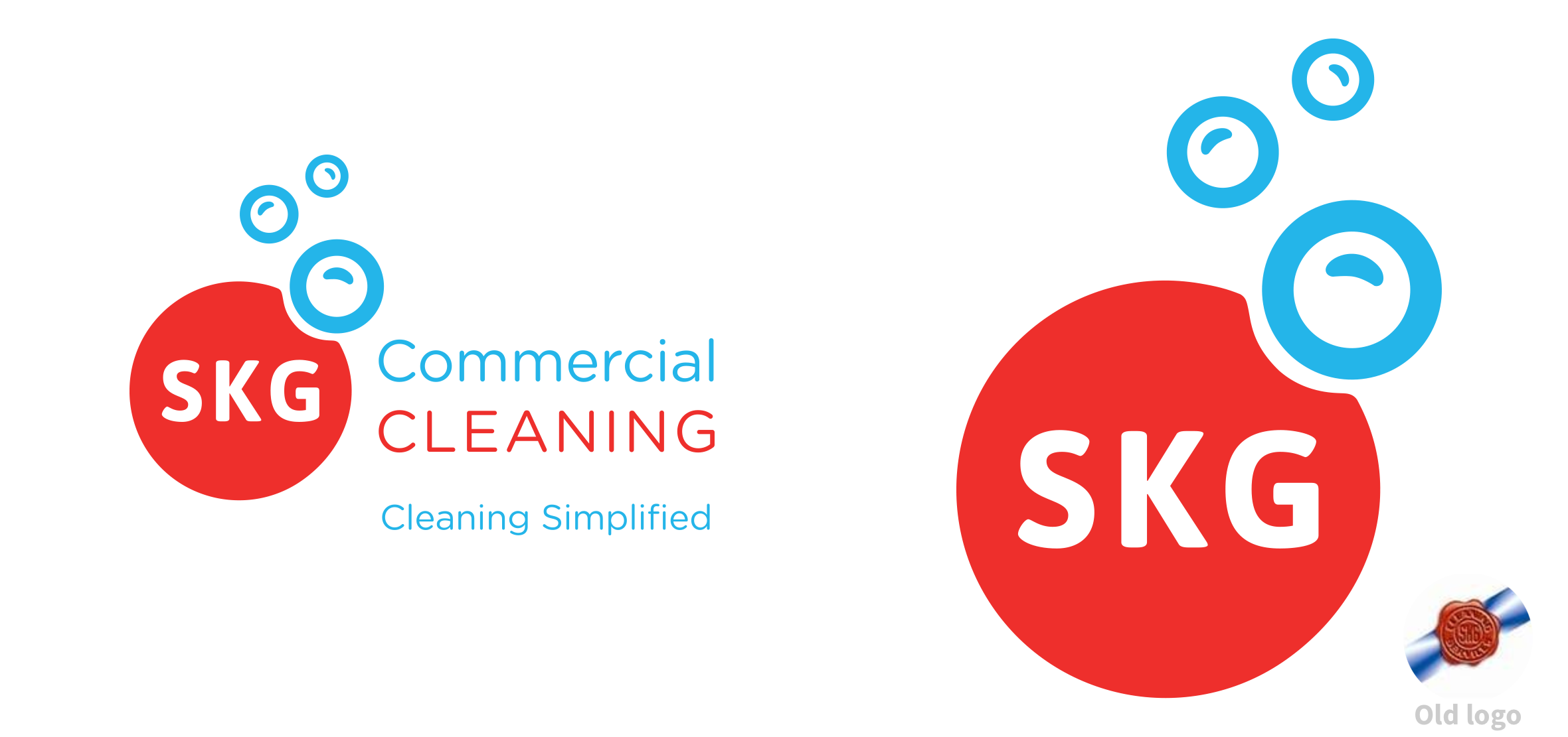
Based on all the feedback it was pretty obvious that one of the other problems with the existing logo was that people cannot distinguish between SKG being a household or commercial cleaning company. They definitely wanted a solution that solved this problem, to achieve that a Combination Mark logo made the most sense and was the best choice for SKG, which will clearly state the type of cleaning company it is.
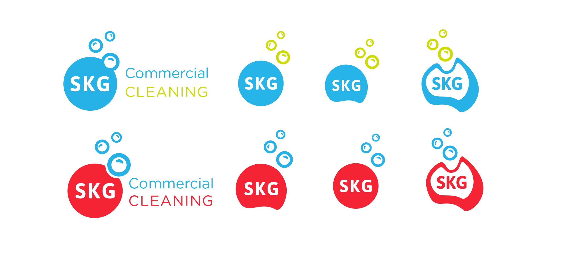
So it was back to the drawing board and more iterations of the logos. Then the second iteration of the logos was created and narrowed down the choices to about 8.
In every workshop, we would get every single staff member to come in and choose their top 3 logos, and I would ask them what they like about those choices to get a deeper understanding of what motivates them to choose those ones.
And the results could not be further apart, it seemed that the female choices and the male choices were very different and there were some that hovered in between. So over iterations and workshops, we kept narrowing down the choices, but we made sure it was a top hit in most choices for both genders.
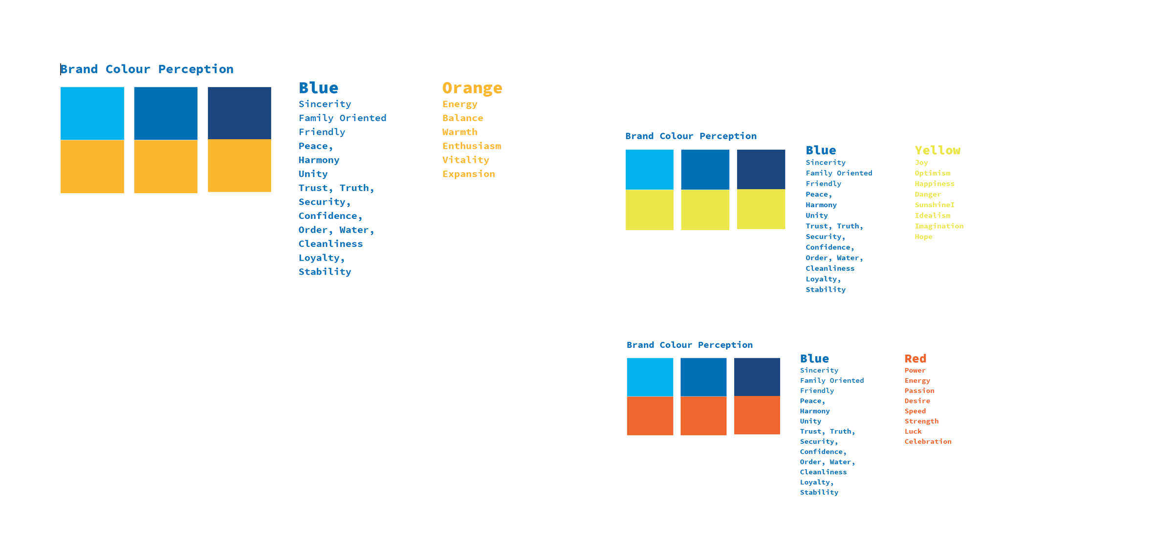
I also did some 9 colour meanings and charts for the SKG staff to look at and see what colours they are more attracted to and what meanings resonate with them when it comes to SKG. So I was running the colour choices separately and not applying it to the logo yet.
Design - Phase 4
How I ran this workshop was very different to the rest. We asked individuals to come to a room one by one, we asked a series of questions from each individual, and then based on their feedback, I would change the design slightly to see if we get a different reaction once they came back into the workshop, and looked at the logo. We ran that 3 times with each individual and results were so interesting, I could not even grasp the direction it took, the final iteration of one logo which seemed to be in everyone’s choice made it to the winner-list, and that logo was the least favourite at the beginning of the project but some colour and minor changes in shape just put it on the top of the list.
Everyone was so excited about this particular logo and it definitely was not my first choice but it worked for them and at the end of the day, it’s about the people who want to carry the brand and use the logo, if it works for them, then I’ve achieved my goal.
Deliver - Phase 5
Once the logo was finalised, then it was about reproducing the correct RGB, CMYK and HEX colours for the different channels, and applying the logo to their company email signatures, business cards, letterheads and all the artifacts that were agreed on.
Launch - Phase 6
Business cards, letterheads, email signatures have been printed and the company profile is in its final stages.
Postmortem Analysis
Successful
- The whole design process was fun and collaborative and everyone is very happy with the new logo
Unsuccessful
- I had way too many iterations of the logos, I could have done a lot less