Problem
Upon launching the newly designed website, SKG customer portal access was entirely broken on mobile. And on the desktop, customers lost access to the actual website once signed in, even though it was all under the same URL. There were complaints from new customers about the site content, and some negative feedback about the site navigation.
Solution
Created a seamless experience from the website to the customer portal and vice versa by creating a responsive site that allows the customers to access their dashboard from any device, and enhanced the site content, interaction design and visual design.
My Approach to The Solution
Envision - Phase 1
Started the project with an initial kick-off meeting with the Managing Director and the executive team of SKG, I nailed-down on those business objectives behind their goal and what they’re trying to achieve. And it all came down to the negative feedback they had received after the site launch from the existing and new customers.
Also, conducted several other meetings with the contractors to gather knowledge, and understand how the site is being managed and maintained, and what the underlying technologies, dependencies, constraints are within the project.
Then after the initial research and collecting all the insights from the launch, it was clear what the UX objective was, to improve the overall customer login experience.
Once that UX objective was agreed on, then a detailed proposal was prepared which included the project timeline, budget, resources, and the artifacts of the project, and setting the scope and expectations around what’s included and what is not included in the delivery of the project, considering that they had a small budget for the site improvements, to begin with.
Discovery - Phase 2
An interview with the site developers made it very clear that the customer portal users were initially set up on a WP plugin, and when the site designers changed the templates to Joomla, it broke the entire user access and they had no choice but to work with what they had.
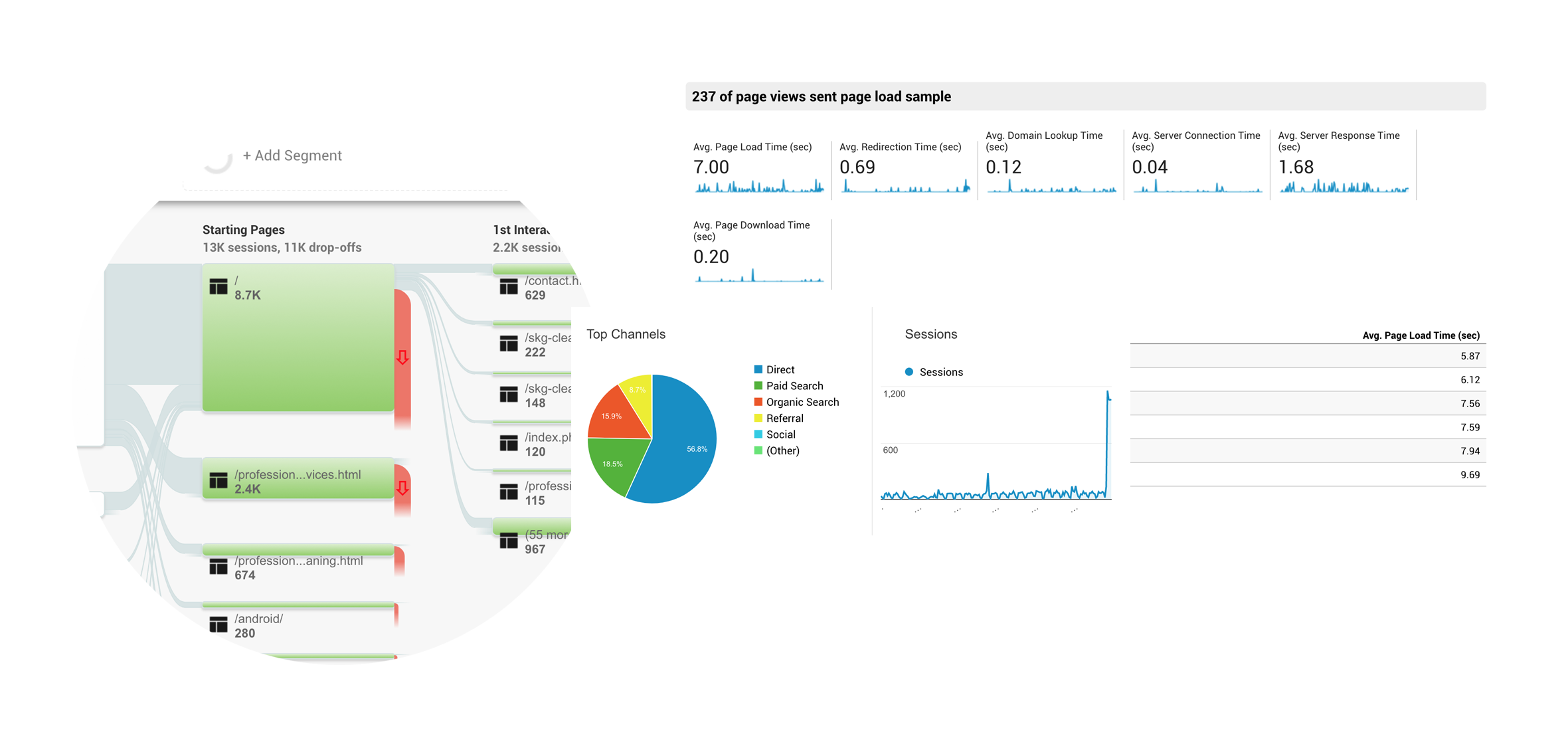
I always like to go through available insihgts and analytics to understand what I'm dealing with. I went through the user flows, behaviour and drop-offs, as well as page loading time to see where possibly improvements can be made in the site enhancement.
Then the search to validate all the feedback and assumptions began. To understand how new users perceive the website, I initially did a heuristic evaluation of the site to understand if there are any apparent issues with the site other than all the insights collected. I ran a usability test with 7 individuals from a non-cleaning background using the speak out-loud method and a series of questions targeted at the UX metrics I was interested in, with the specific criteria of their first impression, trust rate, navigation use and confusion moments, findability and scan-ability of content.
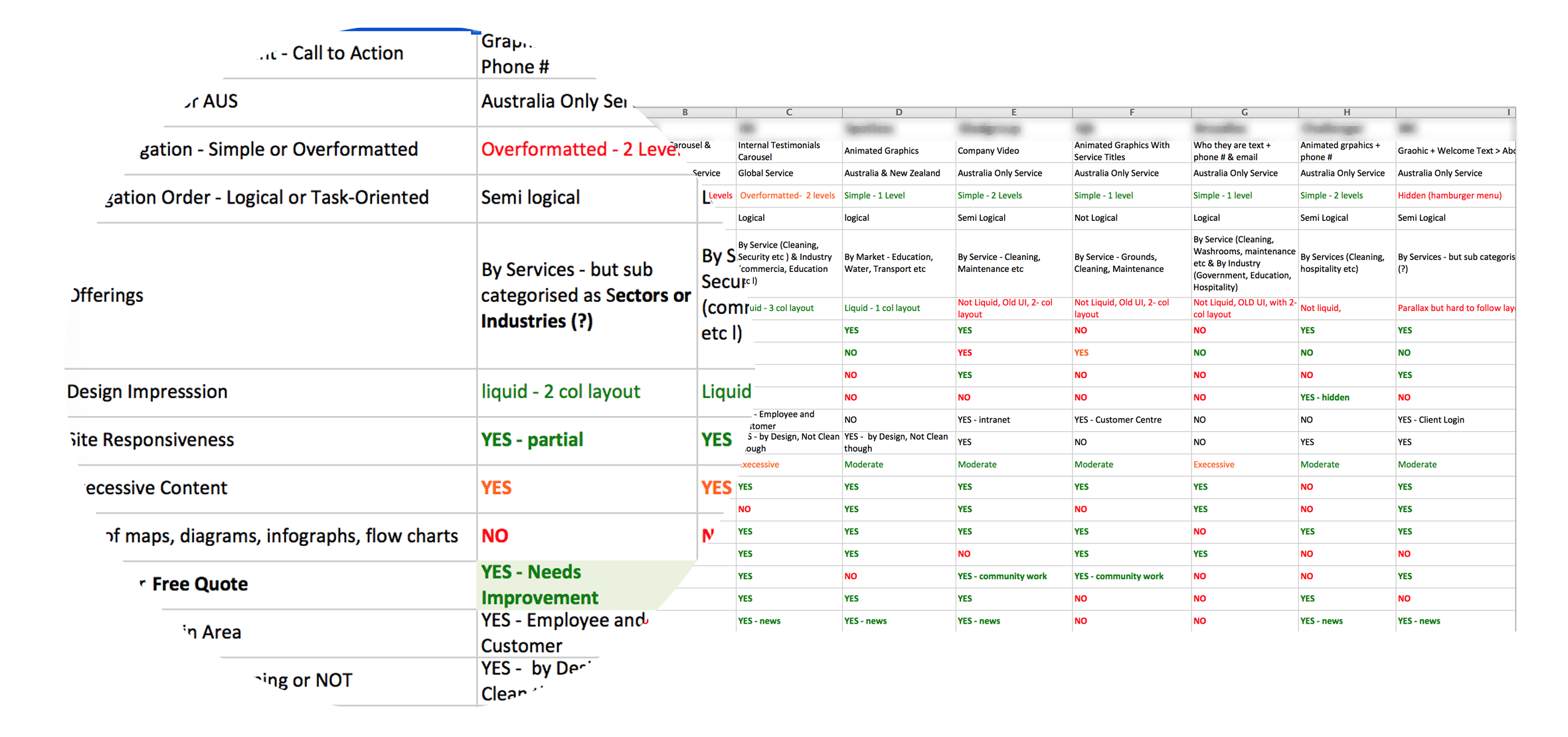
Then conducted competitive analysis of the top 7 competitors of SKG website. I set about 25 different criteria such as site navigation, loading speed, site responsiveness, scan-ability of content, visual design etc. Sharing all the information gathered from each phase of the research with the stakeholders, is a process of mine, because it is often an eye opener and sets the roadmap for the areas that can be improved throughout the project life cycle. As often there are a lot more micro UX problems than the stakeholders may perceive initially.
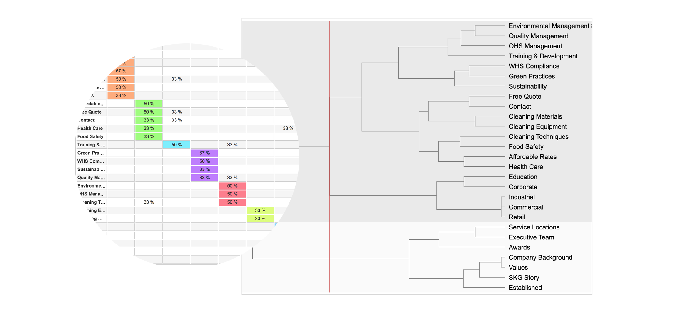
Throughout the discovery stage, it was obvious that there are some information architecture problems with the website. Different vocabulary used to define the content, the tone of voice and the information grouping is not as clear as the competitors, which was validated through the initial website evaluation. Then decided to do some internal investigation to find out how the website content is perceived by the different departments within the SKG company. Created a hybrid card sorting test with 17 employees from the executive level to the receptionist and some random customers, and then used the results to do the new IA.
As a UX designer I make myself open to discussions, especially if working on a client site. With the collaboration of the stakeholders, I was accessible to the staff and anyone who would have liked to provide feedback through the life cycle of the project. Often you discover problems that exist with a project that you are working on, which has not really been addressed, such as the HR department of SKG that struggled with the phone calls they received from random cleaners wanting to work at SKG and the lack of processes around that, and I addressed this issue by creating a CAREER page on their website where cleaners could have access to upload their resume and let SKG staff know of their availability, the states, days of week and times of the day they would like to work.
Now it was time to validate those initial negative customer feedback assumptions and have a deeper understanding of how the customers are using the customer portal and what those pain-points are. Through some email surveys with open-ended questions, and on-site interviews with customers and cleaners I validated some of those issues, but other discoveries were also made which were reported to the stakeholders.
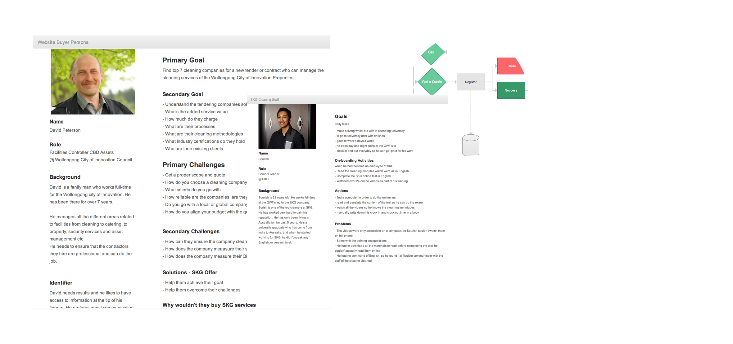
After having enough data the personas of the website, and the customer portal were created, and the user flows and user scenarios were defined.
Define - Phase 3
Presented the discoveries of the customer portal to my client in order to make the final approval as there were a lot more issues to address than initially had discussed.
Once we came to an agreement regarding the budget and schedule on the proposed solution, then moved onto doing ideation and conceptual sketches on paper, incorporating all the qualitative findings in my concepts. Ran a workshop in the SKG office to showcase the concepts and how I plan to solve the problems discovered through the discovery stage of the project.
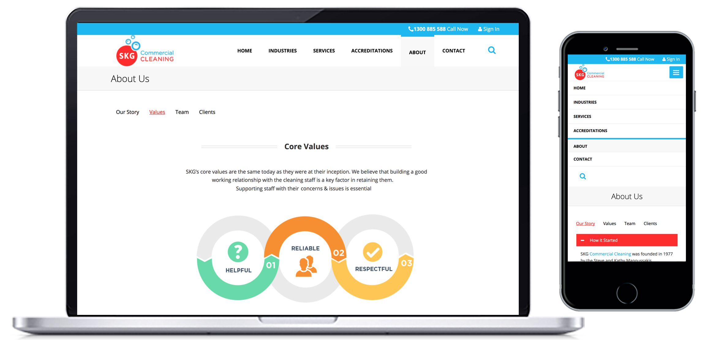
Spent 1 day doing some multi-variant testing with HTML/CSS templates, Created three different navigation structures to test, mega-menus, primary and the secondary menus and just single level menus. Based on those findings further changes were made to the design. The more percieved usable design was presented to my client in a workshop.
Design - Phase 4
It was time to do the visual design, and to be more efficient, I implemented it using HTML/CSS. This is a faster technique to my opinion when it comes to low-functional websites. I’d like to normally do the visual design of only 3 main base templates of a site and collect feedback on those before implementing it across the entire site.
By the time all the visual design was implemented across the site, it was time to incorporate the entire site content too, and the main goal was to address the content challenges highlighted in the buyer persona of the website. But also to reduce the keyword stuffing and repetition of content across the site which was highlighted in the initial tests.
Deliver - Phase 5
Once all the changes and findings were incorporated into the prototype, then began writing the interaction design guidelines for the front-end developers based on the new user scenarios for the functional part of the website.
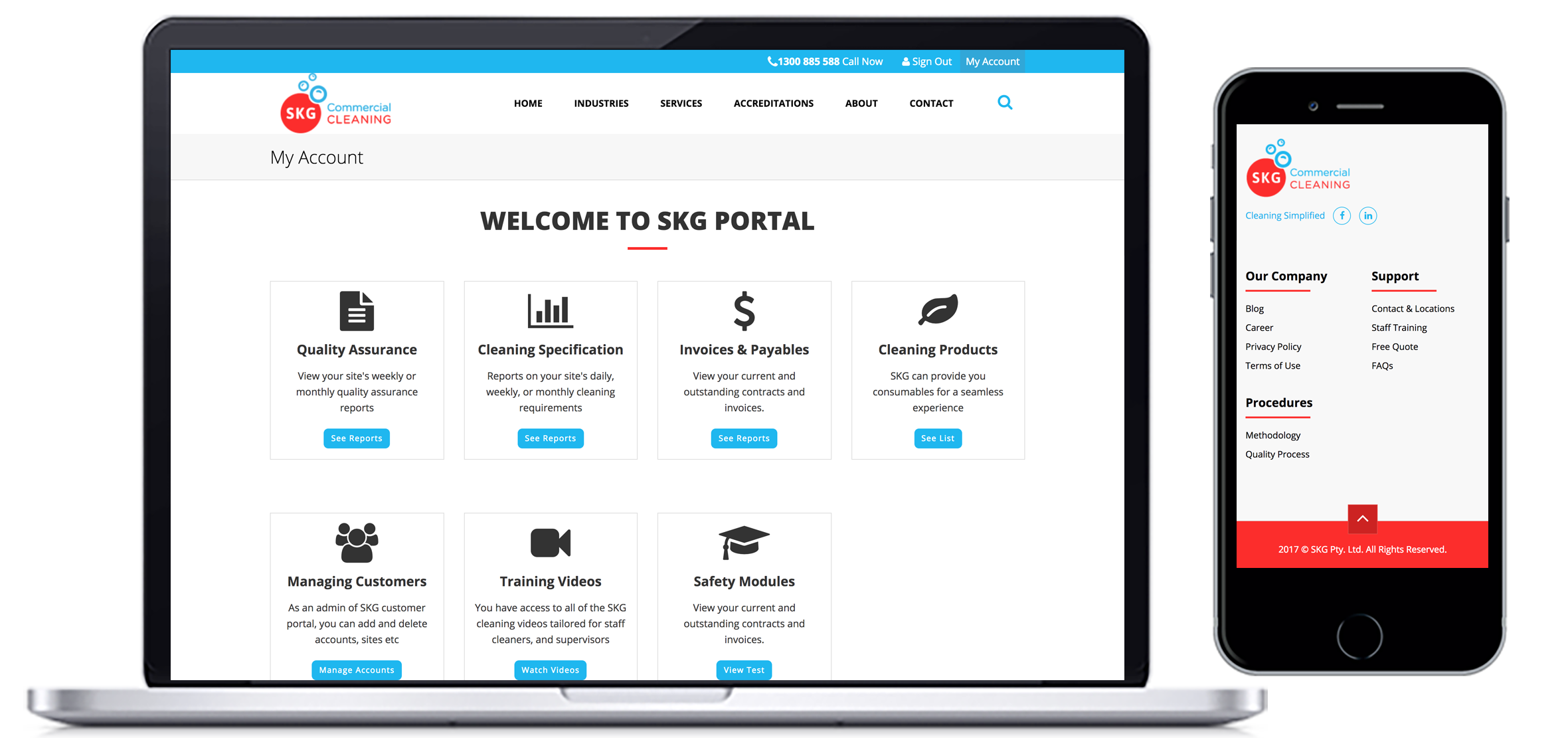
The penultimate stage was incorporating the content into the HTML templates. The infographics, and assets for the website, as well as optimising the images were last on the list. Currently, the new design is being implemented by the back-end developers. Will be overseeing the QA of the final design once it's fully functional.
Launch - Phase 6
Soon to be launched…
Postmortem Analysis
Successful
- Advocating UX and getting everyone involved in the process. The feedback from the SKG staff was positive and they all seem to have enjoyed it.
Unsuccessful
- Working with the pace of the company stakeholders and customers has extended the deadline of this project beyond the initial project schedule of 4 weeks
- Underestimated the cost of rewriting the content for the website, which was rejected by the company