Problem
Redmap is an enterprise application that eliminates the manual process of invoicing by providing a cloud automated solution for document management and invoicing. They had done a major convergence of 3 major products into one HTML 5 framework, in order to improve the system architecture by making it more extensible, robust and scalable but as the result the new user interface had degraded in consistency, aesthetics, and standards, which had caused usability issues for their customers in the beta release.
Solution
To standardise the system user interface by providing guidelines, use of consistent controls, messaging, terminologies, simplify the interface, improving aesthetics of the UI across the entire application, and streamlining the problematic workflows.
My Approach to The Solution
Envision - Phase 1
Worked on this project entirely remotely, as I live in Sydney, and the 200 developers who work for Redmap are all located in Manila, in the Philippines, luckily the customers were in Sydney. In the initial meeting that I had with the CEO and the CTO of Redmap, we decided that I work closely with the system architect in order to make the necessary enhancements. The crucial part of the project was the timeline, and they had to release in 3 months.
They also provided me the business requirements document to understand the objective of their 4.6.0 release, and we went through a lot of the problematic areas of the app and all the feedback they had received from their customers who had been testing the beta.
They were also pretty set on redesigning their logo and wanted to incorporate that into the product branding.
Discovery - Phase 2
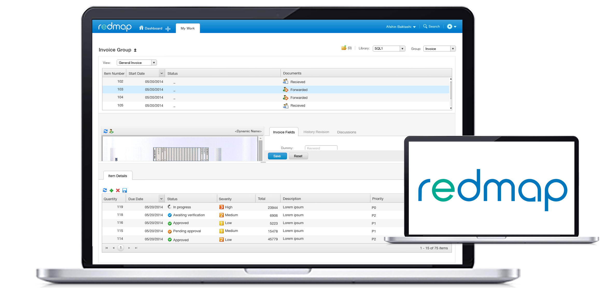
Spent a day interviewing some of their big clients, the ones who were involved in the beta test and from that research, I quickly put some personas together in order to be able to focus on the problems they were having. One obvious problem to fix was the homepage, they found it confusing, and they didn’t know where to start.
Considering the timeline of the project, there was a common area that needed enhancement for all the personas and that was the interface, so I first decided to standardise the system user interface before resolving one of their major workflow issues, so whilst developers had something to work on I could concentrate on the parts that needed wireframing and design iteration. Most of my findings were related to incorrect use of the user interface controls, lack of system status, consistency, clues, and help documentation, and nonfunctional elements in the UI.
One of the things I like to do in an enterprise application interface redesign, is to chuck what’s not functioning, less is more and if it’s not working like the way it was inended to for the end-user, and adds no value for any of the personas then it should not be parking in the UI.
Define & Design - Phase 3 & 4
The major areas that needed to be addressed in this project were as follows:
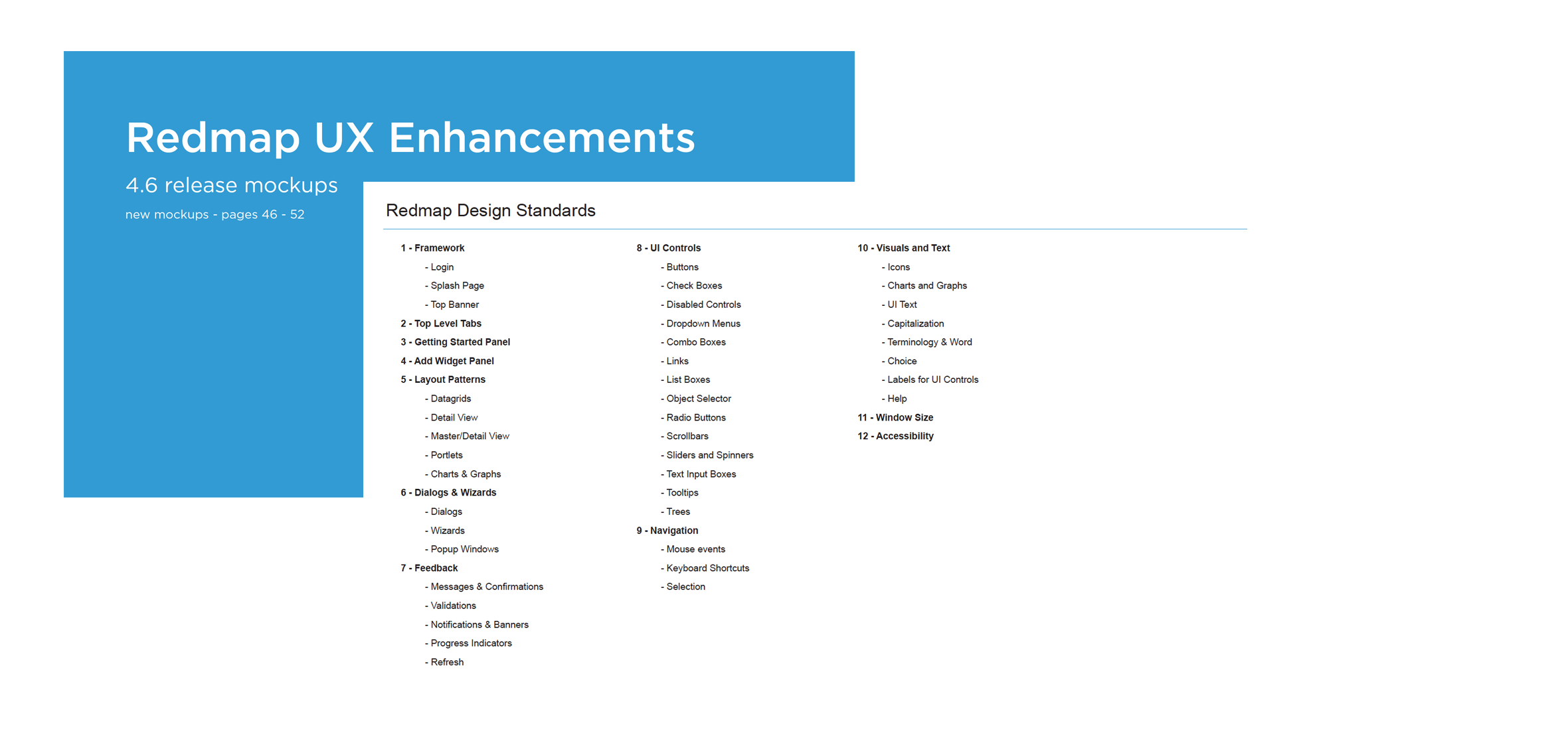
- UX Standards
- Dashboard
- Application Icons
- Designer Workflow
- Branding
UX Standards
Then it was about defining all the guidelines one by one and getting to start implementation as I was working on the other parts of the project.
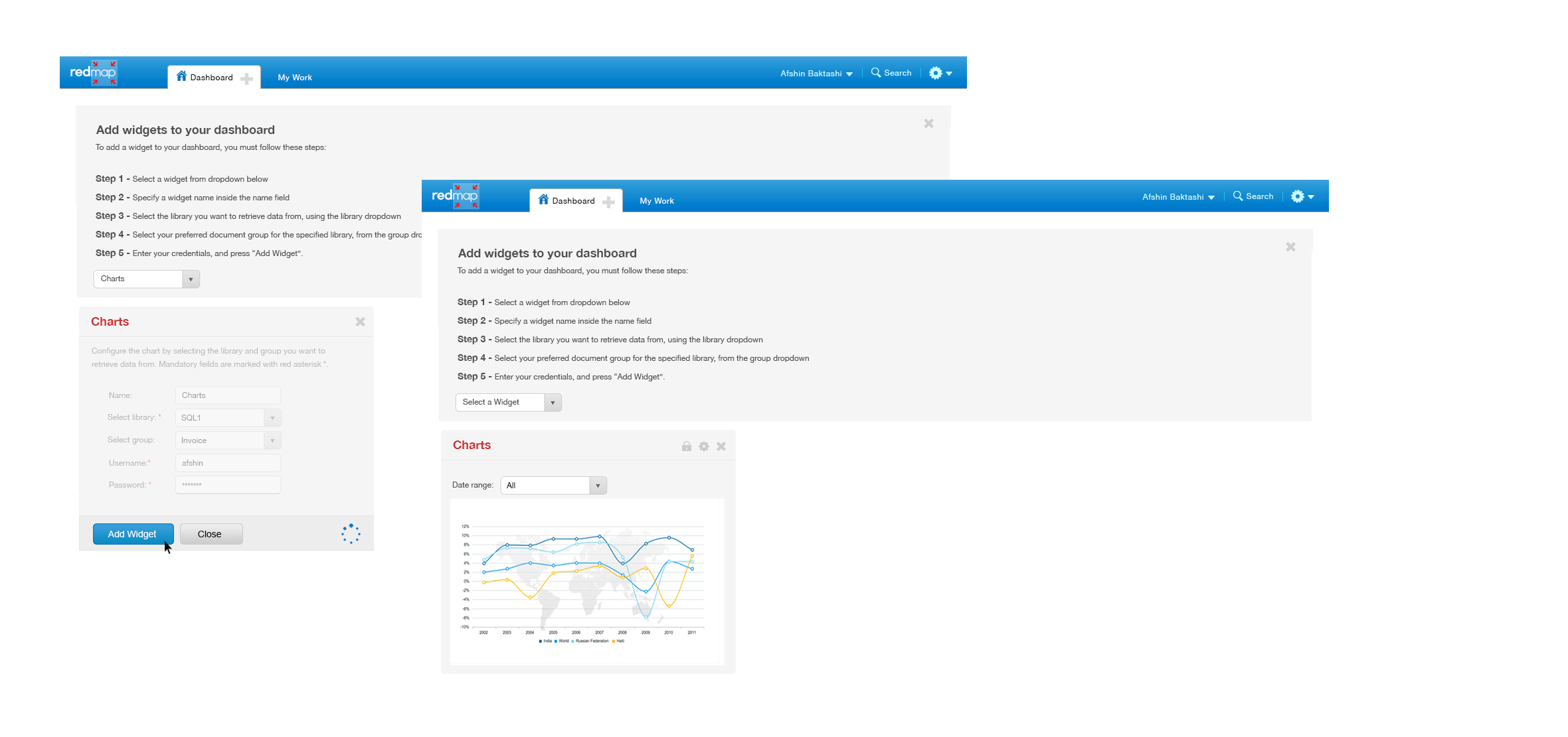
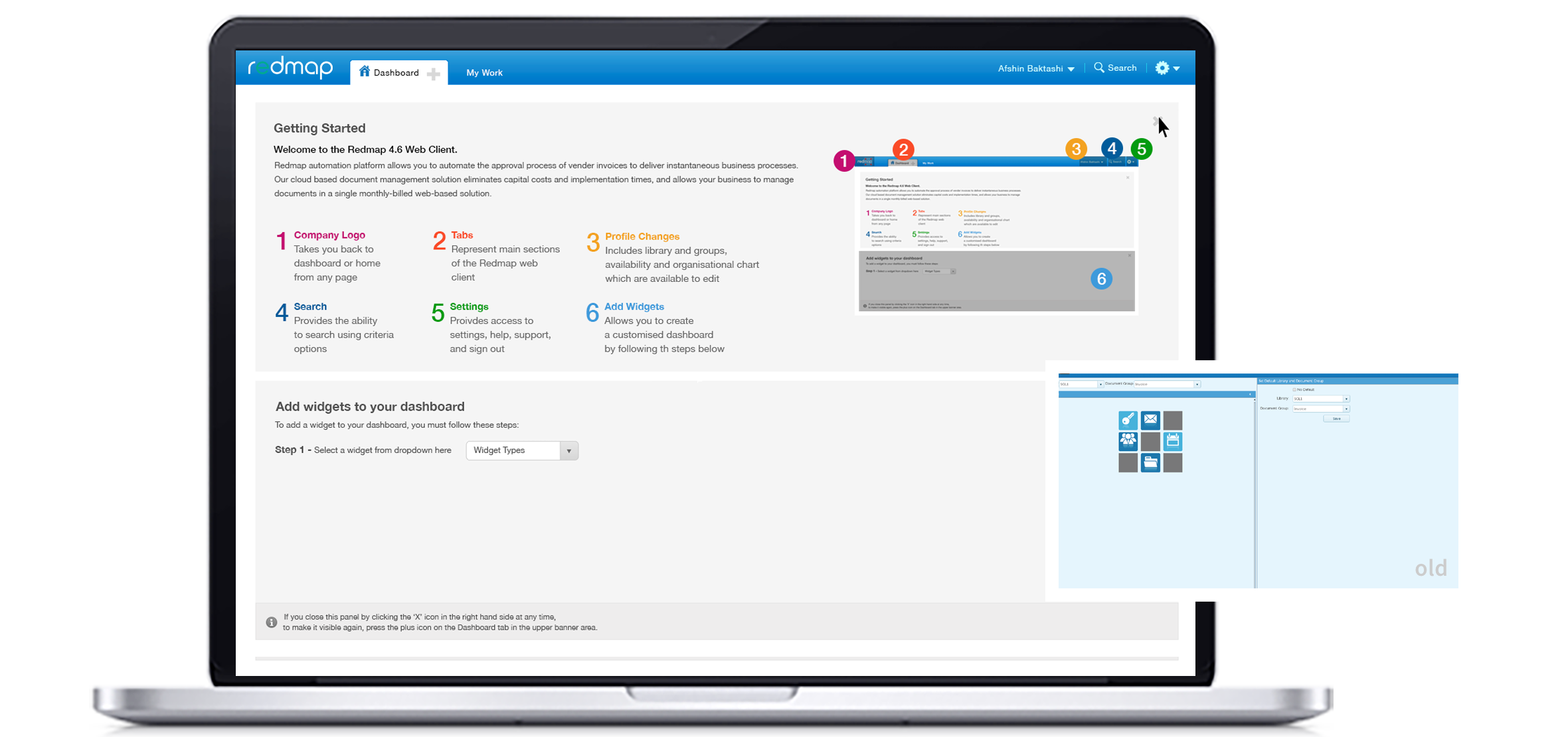
Once all those were completed, then I started on the Dashboard, the customers had trouble understanding how to add, customise graphs to their dashboard so I designed a step by step guideline on how to add those graphs, and incorporated a visual UI introduction to the Dashboard, which user could hide and show as they pleased, the feedback on that design, after a few iterations were very positive.
One of the major improvements we did was changing back all the terminologies to what customers had already learned in the previous versions of the app. This, according to all the feedback made a huge difference because the customers were already familiar with those terminologies and find-ability was a lot more quicker as a result.
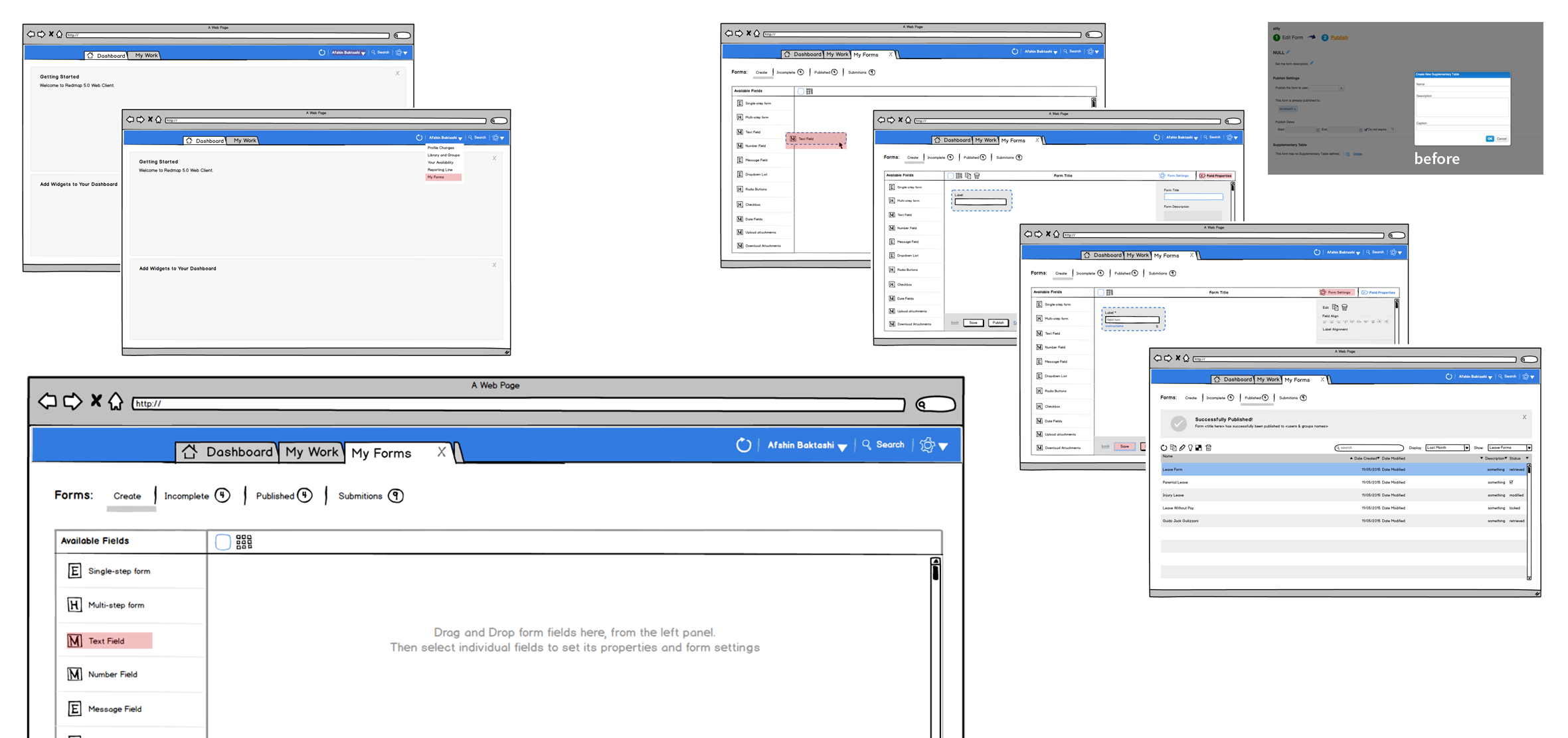
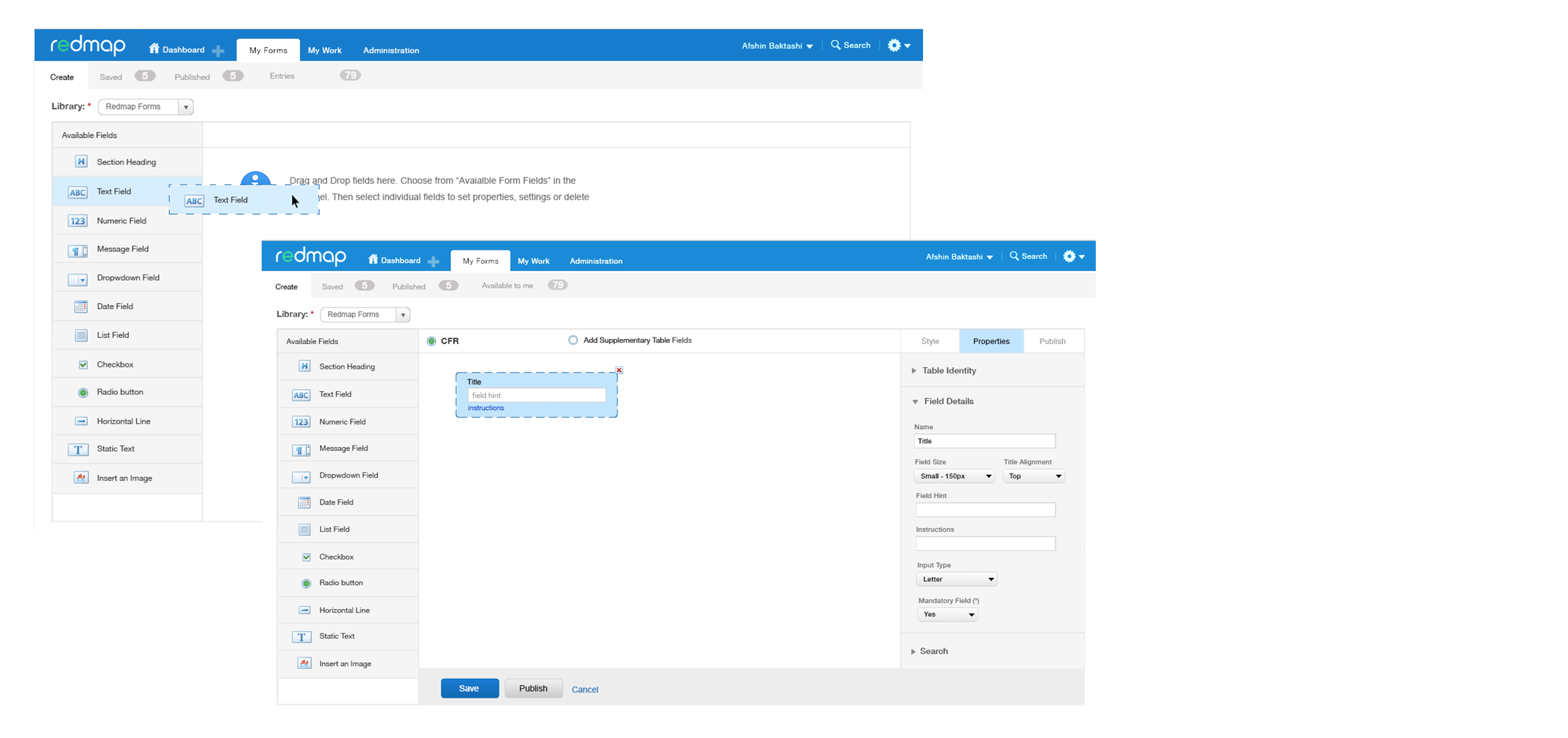
Once all UX standards were done and passed over to DEV then I moved on to redesigning the form designer for the three personas we were focusing on. As a result of this merge, all the UIs relating to Designing a form, editing it, publishing it, and using it were scattered across the app in 5 different areas, so I redesigned the workflow to make the forms available for everyone in the same area of the UI.
After iterating on those low-fidelity wireframes then moved straight onto the visual design in order to pass over the implementation to DEV
I also in between worked on the redesign of their logo
Deliver - Phase 5
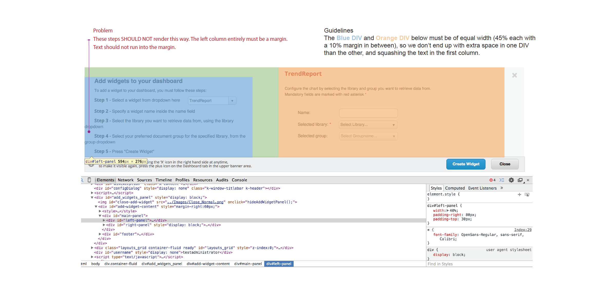
By this stage DEV had already started to implement the standards, and in order to do a quality assurance on the implementation, I would sign into the beta version, take screenshots and then provide feedback on how to enhance the final fit-n-finish of the UI by giving them written feedback and guidelines
Launch - Phase 6
Redmap project was launched successfully, but I was not able to conduct any further usability study on the final solution.
Postmortem Analysis
Successful
- The remote collaboration worked well
- Managed the stakeholders well in pushing back on out of scope details
- Collaborating with a remote team of developers was well managed
Unsuccessful
- Due to the project team being overseas and inability ability to work the HTML/CSS code, 10% of the UI interaction was not implemented exactly according to the standards