Problem
Maths and Language teachers and students still had to travel in order to tutor face-to-face because of the need of writing on paper in those subjects, so teachers and students were still faced with a more physical experience.
Maths and Language teachers and students still had to travel in order to tutor face-to-face because of the need of writing on paper in those subjects, so teachers and students were still faced with a more physical experience.
To create a digital experience where maths teachers and students can still continue their tutoring as they know it, using pen and paper but without having to travel.
Inkerz was a tough gig to begin with. Coming onboard as the CTO of the company when they had just gotten into the muru-D, the Telstra funded accelerator program was challenging, but it all worked out well at the end.
During the first 6 months at muru-D it was all about learning and how to “focus” and execute. It was a lot of pitching, trial and error, raising, attending events, and knowledge transfer about the existing vClass MVP (former Inkerz brand) from the co-founders to myself.
It was all about aligning myself with the new team and their goals and simply being a designer with the ability to create any design artifacts they needed.
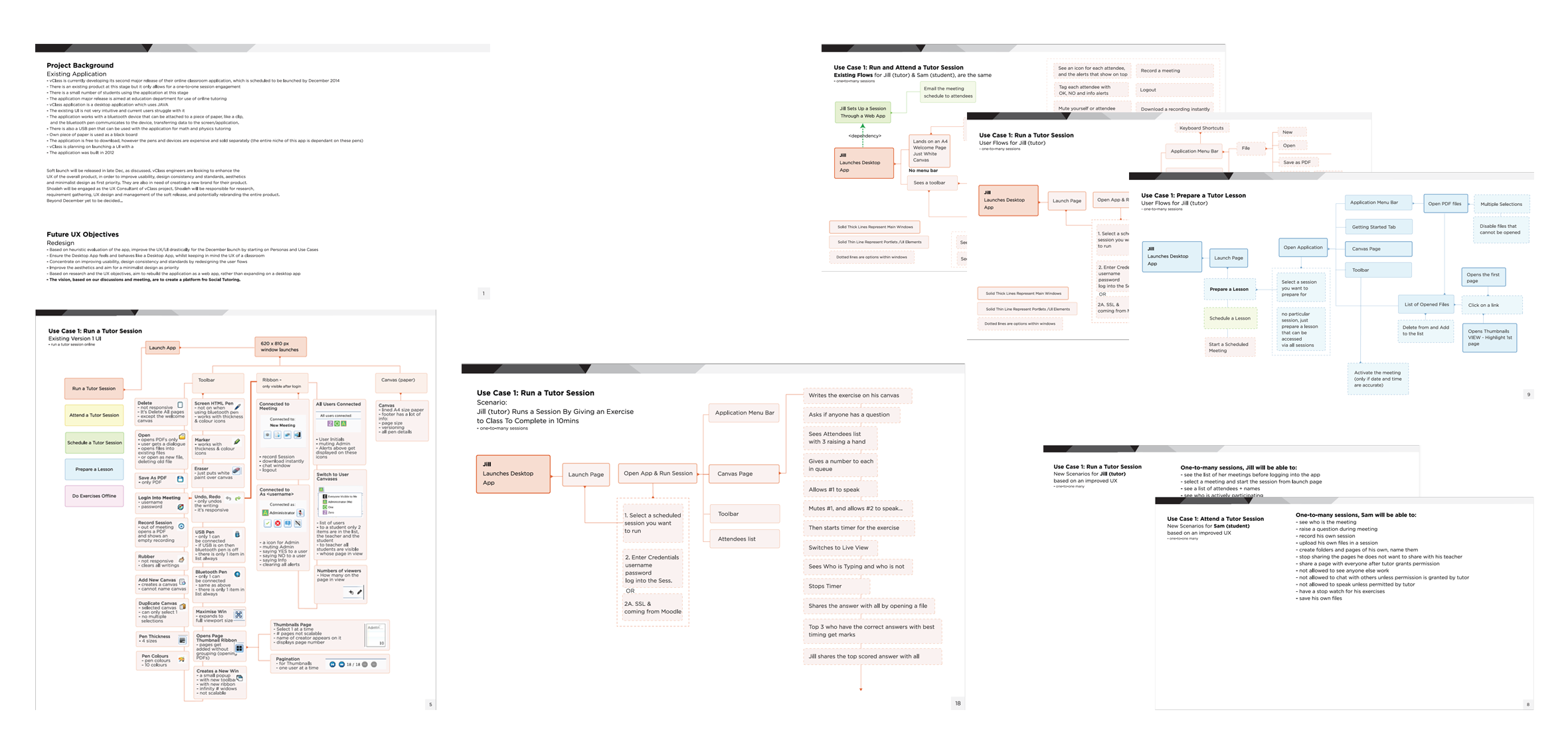
Eventually, after hiring a CTO, it was time to concentrate on the product side of things. Started off by doing decontextualised research by simply collecting any user feedback and problems that the co-founders had come across from the MVP desktop app. I also did a heuristic evaluation of the system to understand it better, and it was apparent that 50% of the MVP features were non-functional.
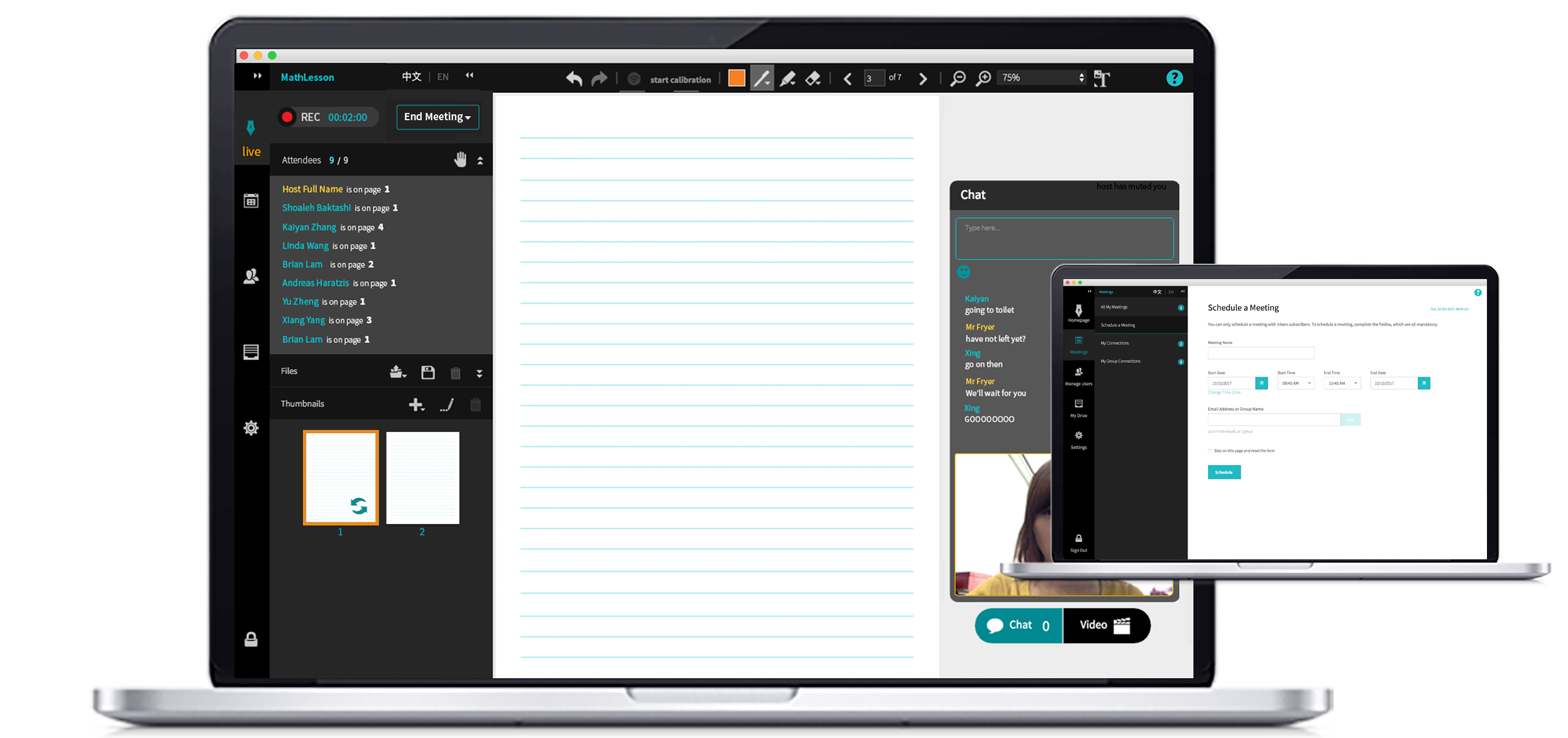
It was extremely important to also understand what worked really well for the tutors and students who had been using the MVP prior to that, what workflows worked well, and why. The MVP had a scheduling web based application integrated with it as well. So essentially the end-user had to interact with 2 different applications in order to have an online meeting which seemed too dispersed.
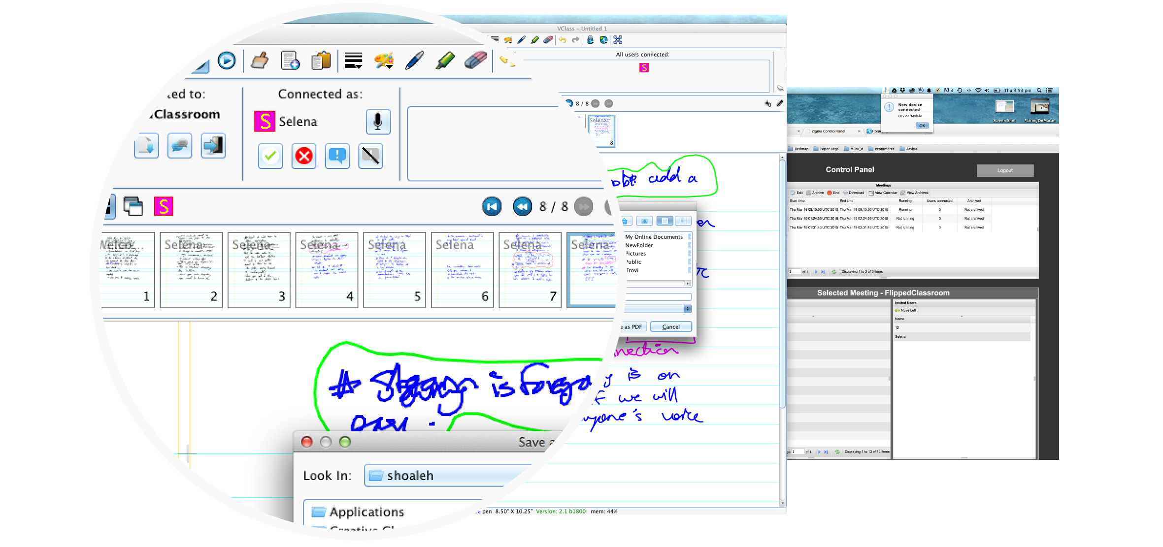
We also did some conceptual prototyping, low-fidelity, it was simply to give visualisation to concepts, kind of carrying a vision and putting it in front of people to get reactions. Those were all based on the existing desktop app.
Three months into the program after hiring a CTO we were ready to turn the MVP into a product so having had the initial insights I started doing a competitive analysis of about 19 different existing tutoring and online collaboration platforms. After having discussions with the co-founders, we based the criteria on features, UI and visual design, and the type of products they had.
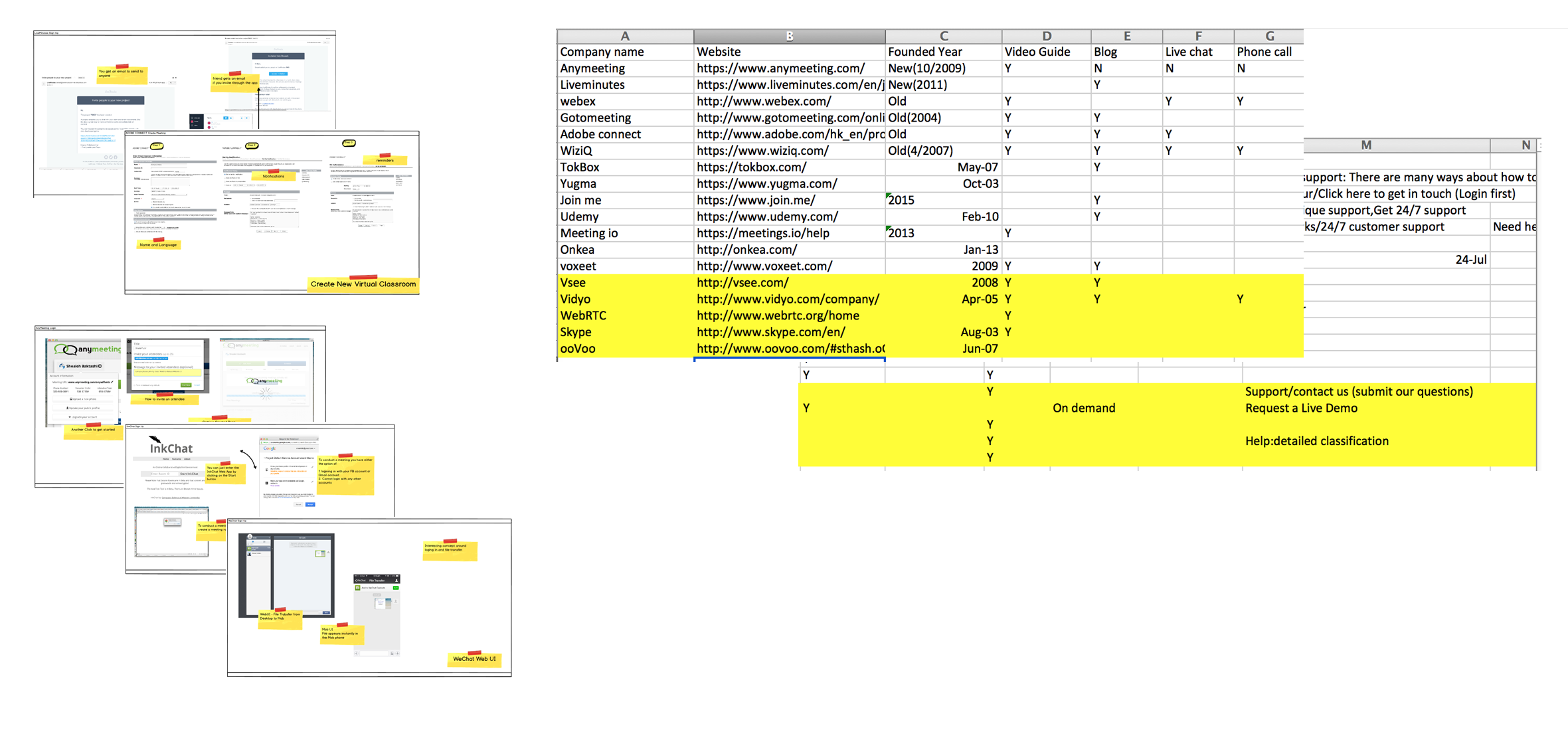
Together with the previous insights from all the feedback, the personas, user scenarios and the existing pain-points they had with the existing MVP came alive.
Documenting feedback was also an important process, in order to iterate on them through the prototyping stages of the app.
After the creation of the user scenarios, then it was about collaborating all the findings with the team, but the challenge ahead of me, was working with personalities in the team who were not used to putting the end-users at the core in the process of building, so this gave me an opportunity to take them on the user journey.
The app sketches and wireframes were not done yet, but the team was under the impression that the first version of the app is ready. It took many meetings, and lots of negotiation and an enormous amount of collaboration to put some structure and a process around how we can incorporate UX more efficiently into our development cycle, and it all turned out positive at the end, but it was a big hurdle to overcome at the beginning, and it was a team effort to address these issues.
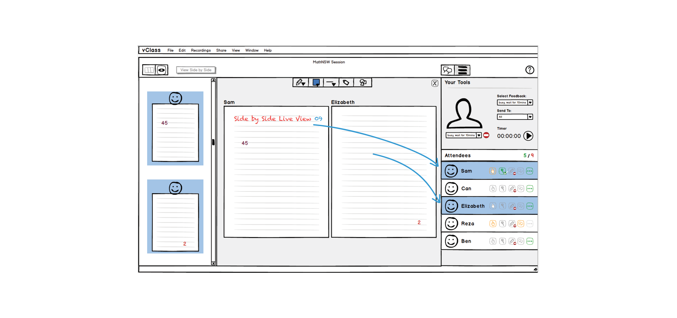
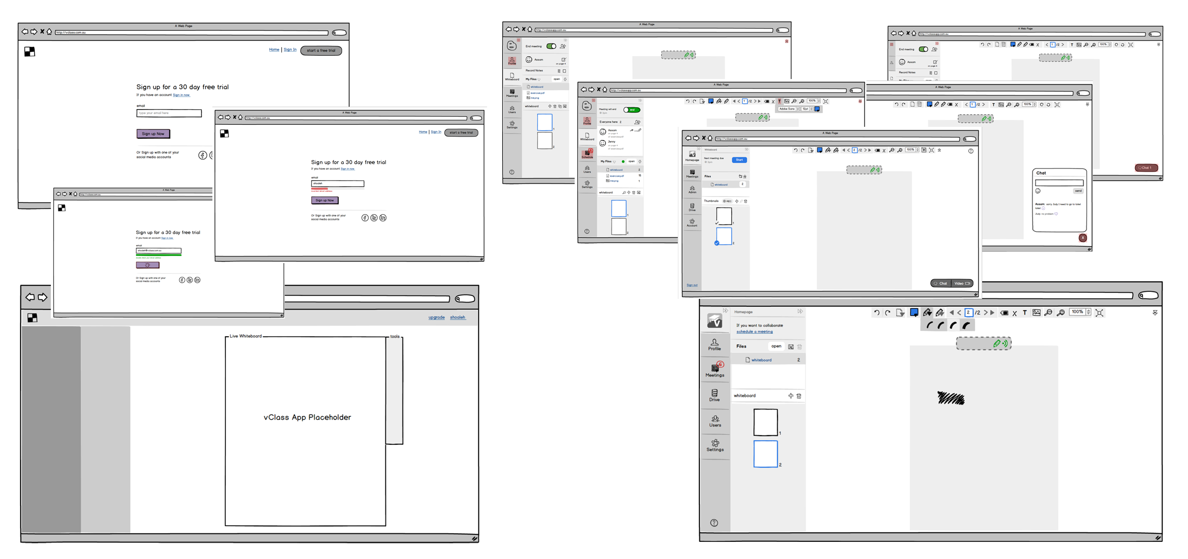
Since we were creating the app from scratch, low-fidelity prototyping was crucial (wireflows), created hundreds of wireframes with multiple iterations. The key here was involving our CTO into the prototyping phase and having him to approve everything before we put it in front of end-users for testing and feedback.
Also, having many uni students and teachers as testers helped a great deal with the process. Once we had the right concept then we moved onto creating a functional prototypes.
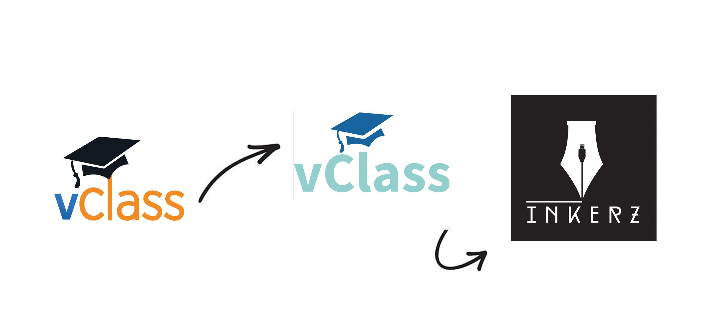
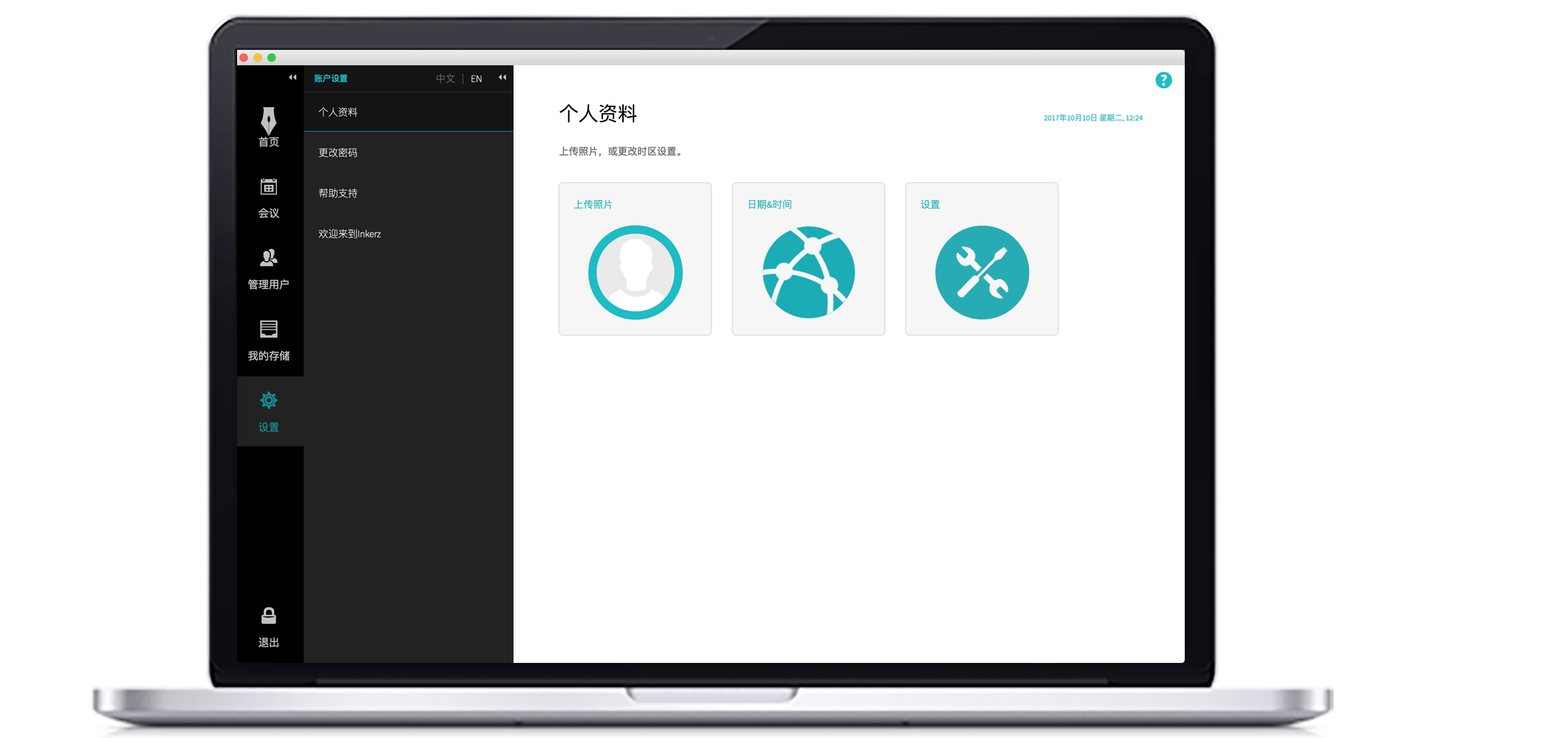
With the visual design of the app the challenge was that when our logo was rebranded from vClass to Inkerz it became black and white. To create an app in black and white that is still appealing, and carrying the brand was a bit hard to pull off, eventually had to have accent colours for the focal points in the UI.
With visual design, I’d like to do 3-4 different variations of the top 3 screens, and once there is a winner design, then It's more efficient to implement the design through HTML/CSS for two reasons, testing the different HEX colours and seeing the results on different hardware. Once the main screens are done, then it is easier for the developers to use the CSS as guidelines.
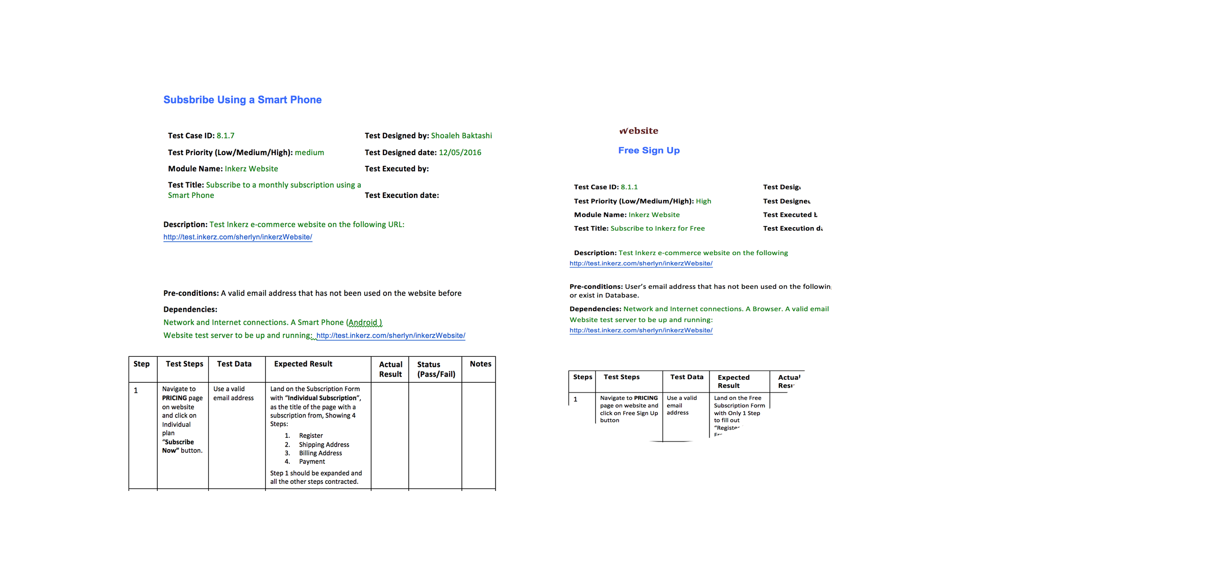
Since we built the app from the ground up to ensure that all the interactions and UX has been implemented according to specifications across all the different channels, and touchpoints, I helped to create a quality assurance document or test cases with every single user story that was written for the app, so others could use to test the application.
Being very detail oriented, It took me nearly three weeks to write the test cases and teach everyone in the team how to test the app, and what pitfalls to look for. Since I have a UX background my test cases were extremely UX driven, but at least everyone was trained to look for those details that is usually missed by an untrained eye.
Other challenges were creating an application which is fully accessible in Chinese language as our co-founders were focused on the China market at the time. This was an extremely process driven task, as every single UI terminology needed translation, including all the help popups to Chines and making sure that the UI does not degrade as a result of the translation, and most importantly to test the UI with Chinese people ensuring that the Chinese translations made sense and it was consistent in tone and the language traditional VS modern.
To finalise the application build, helped with the creation of all sorts of different icons for the developers. Majority of the icons were SVG created in Illustrator, but some of the plugins we had used inside the app needed PNG files and so we ended up with different types of icon files managed by me. Once all the icons were implemented, then it was some major testing for over two months, and bug fixing.
After the initial launch, I ran multiple usability tests, online, scripted, and contextualised with tutors and students to make sure the app performance is decent, and understand the most crucial usability issues we have and prioritise them for the following releases.